Covid-19 has taken the world by storm. It has exposed deep fragilities in our global systems. Our economic systems, first and foremost, clearly require deep reform. Failing to properly account for ecological degradation has unleashed climate change and viral dark matter, both of which have exacerbated vulnerabilities among the worst off. Ecological economists have been raising the red flag on this front since the late 1960s at least. If Covid-19 is not a catalyst for designing and implementing new economic models that help us to arrive at a more safe and just space in our delicate web of planetary boundaries, it is hard to imagine what could be. Our next edition of Africa in Fact deals with this very issue.
The edition thereafter addresses health. Health systems, even in rich countries, were already creaking under the strain of lifestyle diseases. In poor countries, the health burden of infectious diseases such as TB and HIV, along with malaria, hardly disappeared when Covid-19 arrived. Every bed set aside for Covid-19 patients is a bed that cannot be used to treat other urgent health needs. The Economist was quick to point out (26 March, 2020) that any given American ICU unit had more ventilators than entire African countries. While the article contained interesting analysis, the headline carried unwarranted Afro-pessimism – “Africa is woefully ill-equipped to cope with Covid-19”. The Guardian’s Afua Hirsch provided a subtle correction and provocatively asked: “Why are Africa’s coronavirus successes being overlooked?”
On Africa Day, it is well worth noting that any given set of data visualisations reveal that African countries have thus far been spared the worst of Covid-19’s direct effects, though the knock-on effects of global and local policy decisions are still to be fully accounted for. In a unique contribution to understanding the variation in governance responses from different countries, Africa in Fact will be running a special 12-week digital edition of the journal with authors from six African countries – Nigeria, Cameroon, Ethiopia, Kenya, Zimbabwe and South Africa. Each author will write six short blog posts, working in teams of three. In other words, every week, starting on Wednesday, 27 May, we will publish three posts. Over the first two weeks, we cover the first theme – type of leadership response; over the next two weeks, the second theme, and so forth. Don’t miss them.
A quick glance across sub-Saharan Africa reveals that the highest death rate (outside of South Africa) is Cameroon with 5.88 deaths per million. Spain’s is more than 10 times that, with the UK only slightly lower – horrible tragedies that we lament. So, was The Economist wrong? It’s hard to say. But what it didn’t appear to factor in is that, in general, African countries have become adept at dealing with infectious diseases. Moreover, our demographic profile (youth-heavy), and the fact the elderly tend to live at home (rather than in care homes with other elderly people), means that vulnerability to severe infection may be lower than in countries with different demographics and spatial concentrations of elderly people. Despite technological and capacity deficiencies, we’ve found ways and means of addressing health disasters. Ghana and Senegal have led the way in demonstrating innovative, professional responses. Of course, a lack of data and testing at scale remains a challenge for most countries. And death rates in places like South Africa (6.22 per million) are climbing exponentially.
Nonetheless, six weeks after The Economist’s first pessimistic article (linked above), the newspaper published another article titled “Why Covid-19 seems to spread more slowly in Africa”, commending the Ghanaian government for its swift response. From the available data, it notes that the World Health Organization (WHO)’s analysis suggests that “the virus is spreading more slowly in Africa than elsewhere”. While variation is high, and undercounting is likely, “official data are still a rough reflection of reality in many countries”.
The graphs below, produced by our in-house data specialist, Monique Bennett, annotate relevant policy interventions over time in each of the six African countries featured in our special edition. Each graph plots positive infections against recoveries. The recovery rate is particularly important, as it provides epidemiologists with an idea of potential immunity levels, which can help to inform lockdown decision-making and potentially tell us something about the possibility of achieving herd immunity (provided we have a similarly good idea of R – the rate of spread of the disease, which will depend on having far more data).
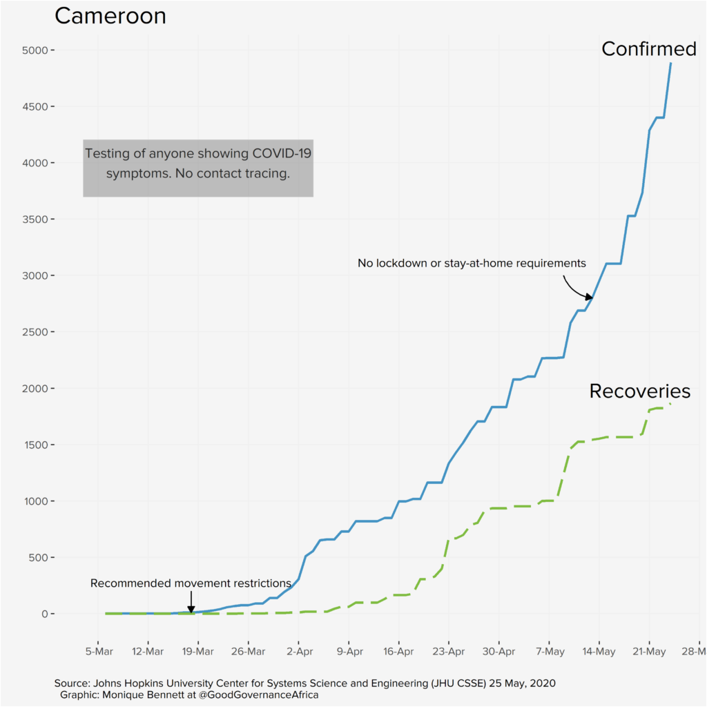
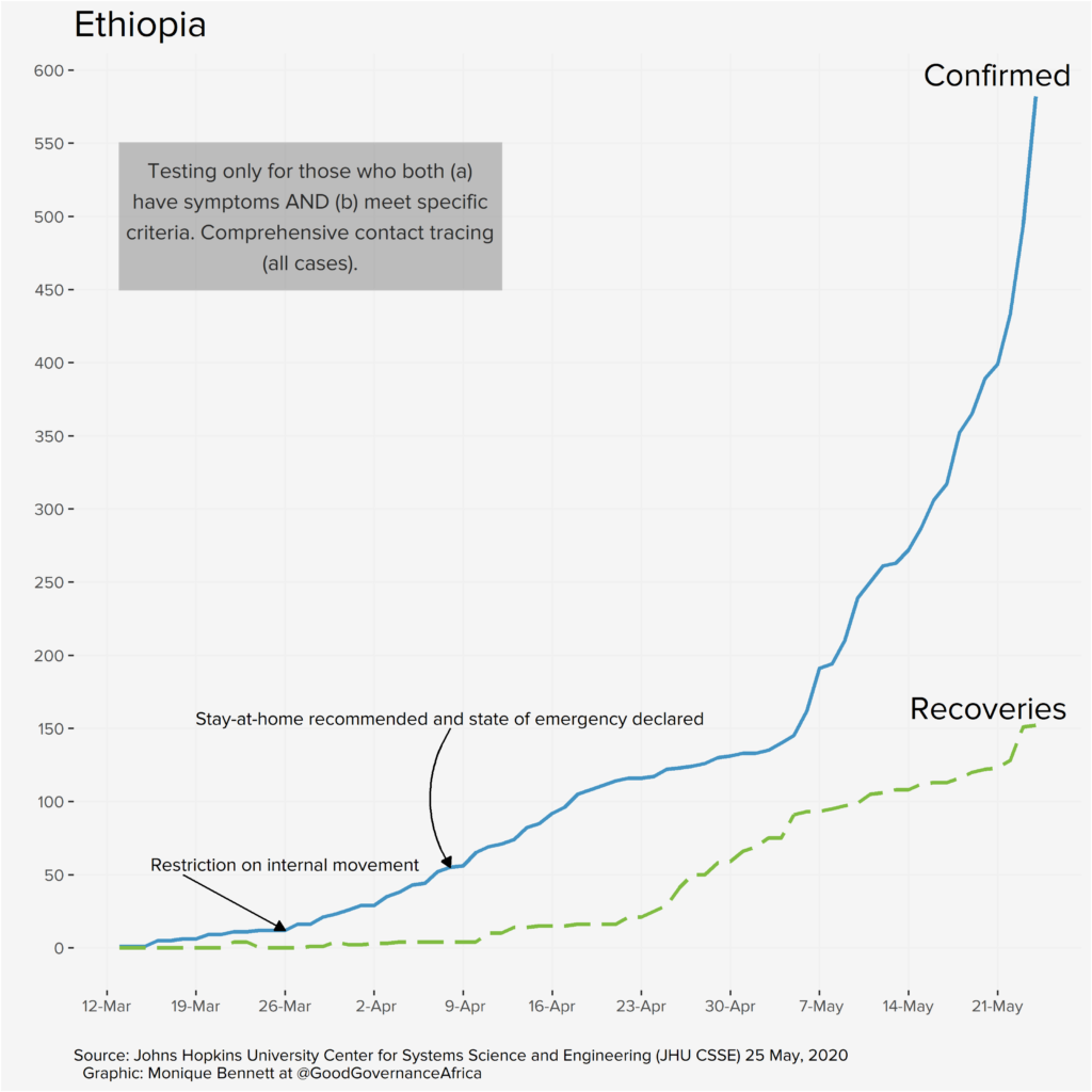
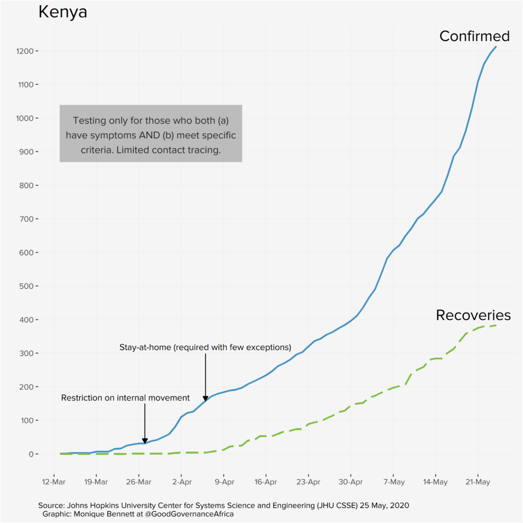
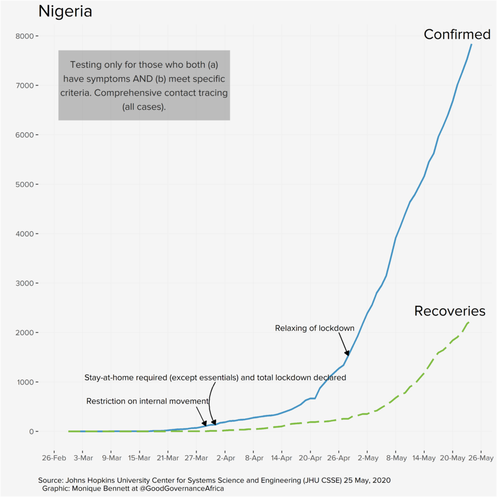
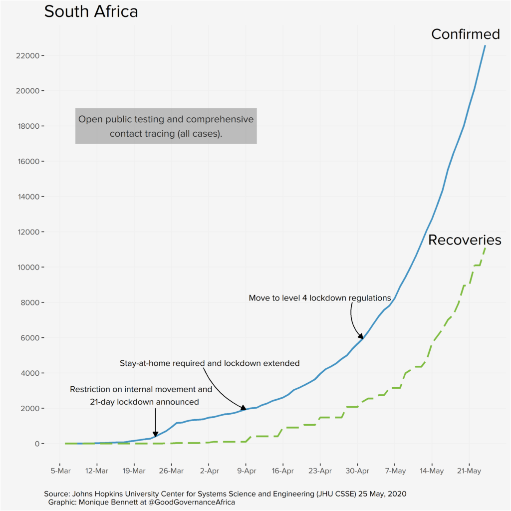
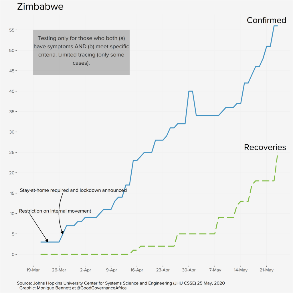
Our proviso, of course, is that the graphs are a reflection of data that we deem useful to visualise from a governance perspective. We are not suggesting that where infection rates appear to slow (or increase) after a particular policy intervention that these two events are causally connected. We are simply plotting a timeline of how things have unfolded according to the public data that we have at our disposal. The y-axes have been differently scaled for each country, so please do take note of that, too.
Each country has very different screening, testing and contact-tracing capacities and strategies; the data presented on the graphs above is ultimately a reflection of those policy decisions, and a function of the number of tests completed. These differences will be addressed in the blog series. So, the bottom line is: don’t miss out on this unique pan-African contribution.


